YouTube is rolling out some major User Interface (UI) changes and new features to the YouTube platform. The changes started on August 29 with the logo change and extended into August 30,2017. According to the YouTube on Twitter the updates will be rolling out gradually so the first day changes were subtle and with new features and changes to the overall layout and naming schemes of popular options in the interface.
I have notice changes on the Trending page, Subscription Pages, Channel Page layout, The watch Page, User profile page and other little changes that look really good. The design looks modern and in alignment with Google’s material design. Things are easier to spot and more pleasing to the eyes too.
Changes to the Logo:
The red Play box that was over the Tube in YouTube is now moved to the left and is now in the form of a red box with a play Icon that looks like a TV set or just a Play button. The YouTube text is in black and looks like a new font. The new look is definitely new but yet retains that element of familiarity. Overall YouTube team has done a solid Job.
![]()
The Watch Page
Things look refined on the watch page with a new font that’s spread throughout YouTube that’s very easy to read. The like buttons, dislike and subscription counter and even the comment section have been given a snazzy new layout. You can sort and organize comments.What I like the most now is that you can adjust the play window to a very nice wide mode that will take up the entirety of the width of the screen and give you a great viewing experience without going full screen.
Data about videos is front and center and you can see subscriber count and more easily along with video views. The Description area is now more pronounced as well for the videos.When the display window is made bigger the logo and elements at the top of the screen shrink and shape up to adjust to the display which is very nice.
How to Activate YouTube Dark Theme for Watching at Night?
Ever wished you could disable that white background for watching videos at night as the white becomes blinding at night? Well you can turn the whites to black by:
1.From the home screen or while watching a video click on your profile picture in the upper right of the screen.
2. A drop down menu will appear with your user profile picture and email address associated with your YouTube account with some options beneath it.
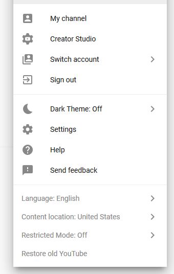
3.Look for the option Dark Theme and enable it by clicking on the option and toggling the feature on. This is basically YouTube night mode.
4.select the option again and turn it off to disable it.
You can use it at night or keep it on as if you love it even in the day.
How to revert back to the Old YouTube?
Believe it or not you can revert Your YouTube to the old look if you wish. Why would you any way? just in case you want to then:
1.Do the same as above and click on your user profile in the upper right.
2.From the drop down that appears select:Restore old YouTube that’s all the way at the bottom of the screen.
3.That’s it you should now be able to go back to old version of YouTube without issues after you give the reason for wanting to revert back and submitting it
4. To go back to the new mode simply go to the address youtube.com/new. Choose get it now and you will be switched over. Also if for some reason you are loving the new look of YouTube and it disappears simply use the YouTube.com/new link and choose the option Go to YouTube and it should come back, sometimes the new system seems to have some slight issues where the new look may disappear.I notice that the new Interface will disappear if you go into the back end creator studio or Video manger section, once you go back to the video page or Home page the new interface will be gone.
Also when you go back to the old YouTube (by choice) note that the New Look will remain but the old interface as you knew it to be before the update will return.
Notice also that you can also choose your content location easily and enable restricted mode or change your language all from this easy to reach menu in the upper right when you click your profile picture. Also the name creator studio is being used to represent the name of the Video Manger screen or where you go to edit and upload your videos which comes from the App on your phone.
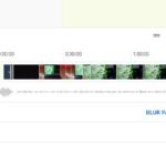
The Trending Page update
The trending page now stacks videos horizontally in one row versus the old style of having two Horizontal rows. The only exception to this is the featured creator on the rise which is organized vertically which makes that creator stand out. Video windows look more pronounced and the text shows off the videos clearer than before.
Final Thoughts
I really love the new changes I hope YouTube changes some more things and adds some cool new features. This is by far not all the changes but the ones that stood out the most for example the My channel page has changed and things move around to highlight the channel logo and videos on page which looks nice and more. If you noticed anything else about the YouTube UI update that has changed please note it below in the comments as always.